-
Announcing Start Menu Reviver 2
By Mark Beare April 03, 2014start menu reviver, start menu reviver 2, windows 8 start menu4 CommentsAlmost a year ago we announced the release of Start Menu Reviver. The product was developed because we saw that Windows users were struggling to adapt to the new navigation methods introduced in Windows 8, namely the Start Screen and the removal of the Start Menu from the desktop. Quite often we observed people struggling to work out where they were in Windows 8. We knew that this was not good for Microsoft nor was it good for the OS that they had created that was meant to be the future of computing.
We have been blown away with the positive feedback that we have received from the press and users of Start Menu Reviver. We knew when we released the product that we would have a difficult time winning over some users because the Start Menu we created did not look like the old one, but once users tried Start Menu Reviver they were hooked.
So, today I am extremely excited to announce the upcoming release of Start Menu Reviver 2!
Here is a sneak peek video of it:
Start Menu Reviver 2 will be available May 1st, 2014.
The Design
Start Menu Reviver 2 is a complete design overhaul from version 1. While most people loved the functionality of Start Menu Reviver 1, the most common complaint was that it didn’t look great. We have partnered with a designer and UX expert by the name of Jay Machalani to work on Start Menu Reviver 2. I first saw Jay’s work when his designs were featured on The Verge. I was immediately impressed with how much research and thought he had put into his designs. It is much easier to design things to just look cool and have horrible usability, but Jay put in the pain staking effort in his Windows 8 concepts to make his designs both beautiful and usable. I was also drawn to his work because of how closely it resembled the general concept of Start Menu Reviver (which, incidentally, is just a coincidence). I spoke with Jay very soon after his article was published and he was willing to work with because he really liked the functionality of Start Menu Reviver but could see a lot of room for improvement in the design.
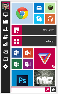
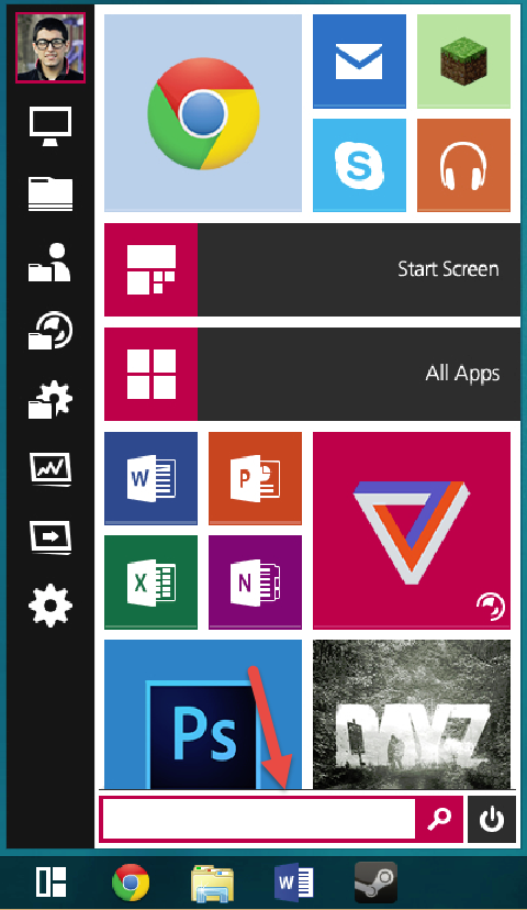
After some pixel perfect design work from Jay, Start Menu Reviver 2 was born. Here is what you will see the first time you run Start Menu Reviver 2:
And here is a better look at the design as it will appear on your desktop:
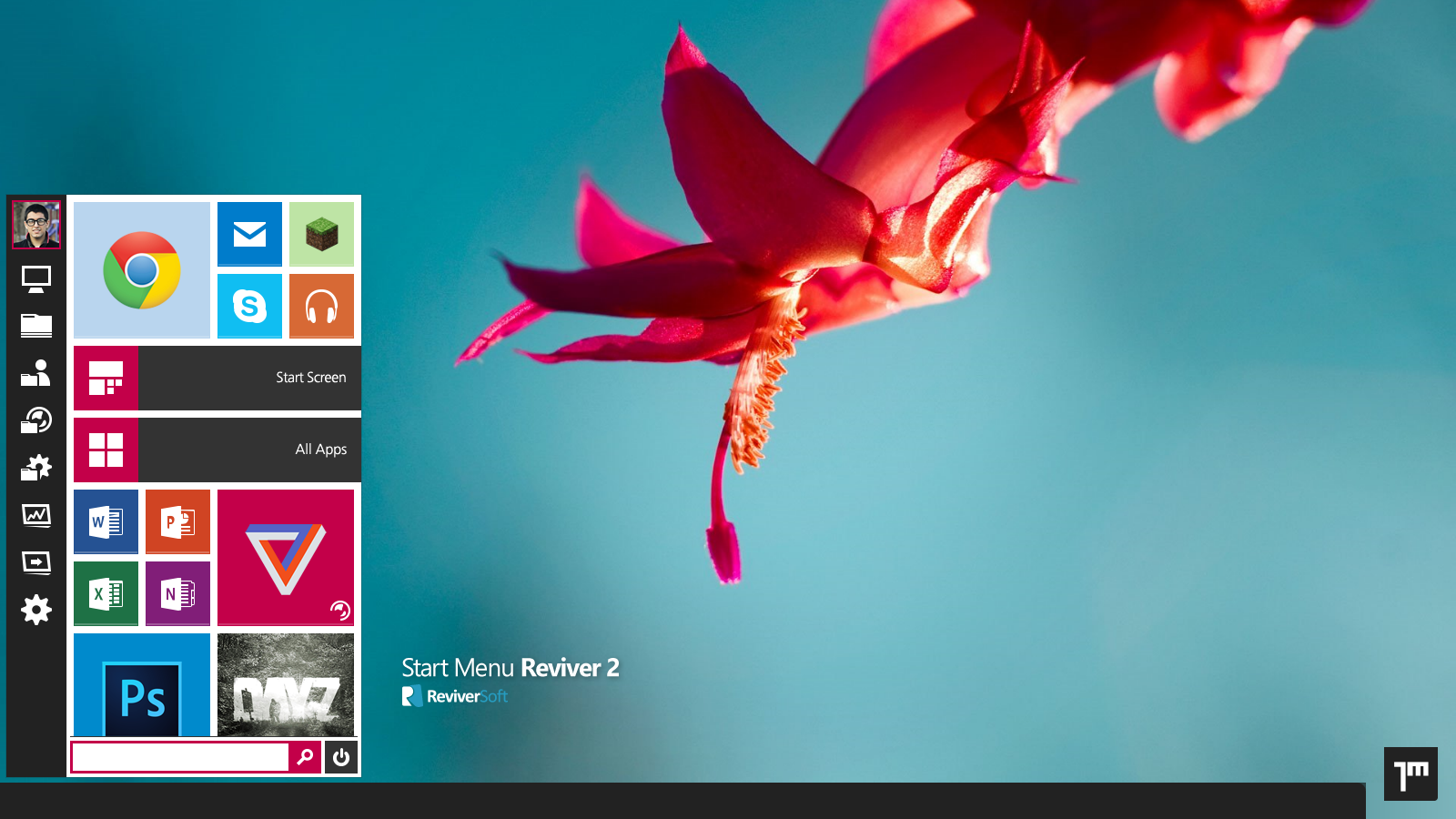
I think you will agree that is a much cleaner design than version 1 and it really does a great job emphasizing the most important apps and tasks for each user.
It is quite easy when looking at a product like this to judge it based on what content is shown in the product. The software itself disappears and can be easily forgotten about. Have you ever seen an empty Start Menu before? While getting out of the user’s way is the intention of the software, I think it is great to show off the product in its pure form. The below image shows of Start Menu Reviver’s true identity:
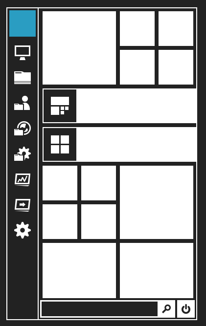
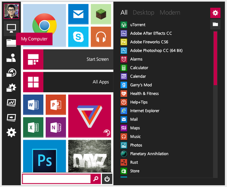
I personally love this view of Start Menu Reviver as it shows our work in its purest form, but for those of you who want to see more complete screenshots, I have a few extra for you below:
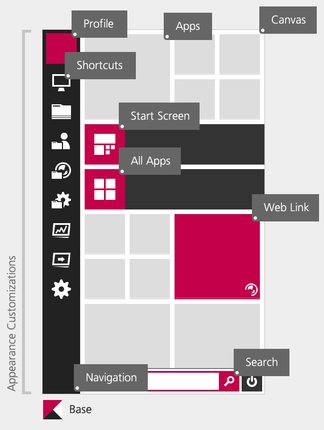
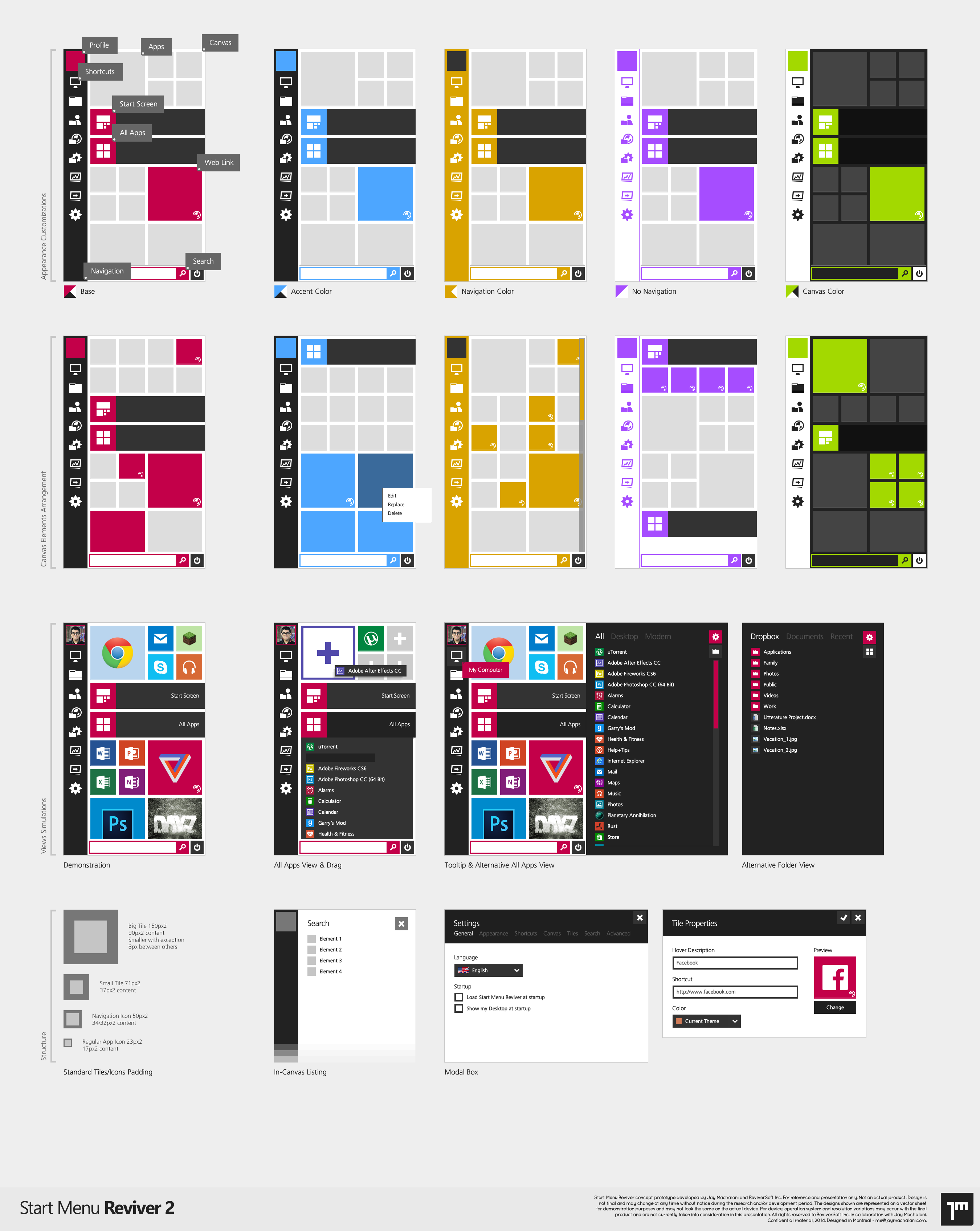
Start Menu Reviver UI elements
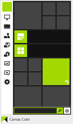
Alternative Color Variations
Standard View
Extended Menu
There was a lot of behind the scenes work to get to this point. Here you can see the original layout concepts that Jay produced for us, some of which did not get implemented for version 2 of Start Menu Reviver:
Other Changes and Features
Design changes aren’t the only things we have been busy with here at ReviverSoft (although it has kept us very busy!). Here are the other changes you will notice in the new version of Start Menu Reviver:
Windows 7 Mode
OK, so this is not the real name, but this setting in Start Menu Reviver 2 has been added for people who don’t want the tiles at all and would prefer to just see the extended menu – Kind of like a traditional Start Menu.
Animations
When is the last time a Start Menu made you say ‘Wow’? Well, Start Menu Reviver is aimed to do this every time you press the Start Button. Here is what Start Menu Reviver looks when you open it.
Simplification
I know that I have already touted the design changes in Start Menu Reviver 2 but a conscious effort was placed on simplifying the product. In some cases we had lengthy arguments over what to keep and what to remove. You will notice that we no longer have text in the left hand ‘charms’ menu. This not only simplifies the UI, but also makes the product look much better in languages where typical text length is longer than English. If you look at Start Menu Reviver 1 in English and then look at it in German you will see what I mean.
We also have replaced the ‘Recent’ charms option in favor of a ‘User Folder’ option. This was done based on user feedback and usability testing. We found that people are more likely to use a recent documents list within an application itself rather than the one found in the Start Menu. People also appreciated having access to ALL of their documents that can be found in their user folder. That being said, the Recent documents list has not been removed from Start Menu Reviver – you can still find it in the extended menu – you just don’t have to option in the left hand charms menu.
Showing Websites As Tiles
One of the great features of Start Menu Reviver 1 was the ability to add websites in your Start Menu. This enables you to directly access gMail, Facebook or whatever site you want with just a click in the Start Menu. In version 2, we have made identifying website tiles easier by adding a web icon in the bottom right corner of tiles that go to websites.

More tiles!
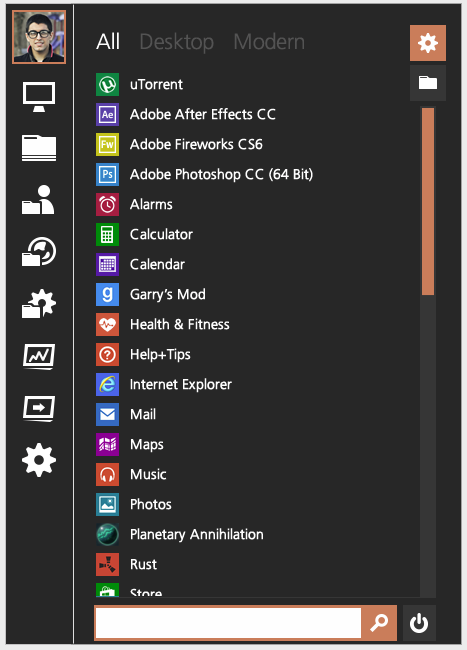
Now this has been a heavily requested feature and we are really excited to offer in Start Menu Reviver 2 – The ability to scroll down the tile view! This means you can add more tiles to your Start Menu (Up to 64 in fact). How cool is that! The below screen shot shows how the lower tiles are cut off and you can scroll to see more.
But it’s still FREE Yes that is right, we have still kept Start Menu Reviver completely free. We have loved hearing from people that feel like they want to pay us for the product. It’s a massive compliment, but we want to help as many Windows 8 users as possible find the best way to navigate their computer. So enjoy!
So are you ready to get it?
I’m sure there are many other things you will come to love about Start Menu Reviver when it is launched on May 1st. If you would like to be notified when the product is released you can do so on this page. All Start Menu 1 users will be notified via a product update when version 2 is released.
If you would like to read some more about why we developed Start Menu Reviver in the first place then please keep reading. For those leaving me now, I sincerely hope you like Start Menu Reviver 2!
Why We built Start Menu Reviver In The First Place
When we were researching the product we saw that there were plenty of other companies who had made Start Menus for Windows 8, but they all looked to the past in their design. They were mostly replicas of the Windows 7 Start Menu and we felt that this was not complimentary to the vision of future versions of Windows. We also noticed that most of the other Start Menus on the market disabled the Windows 8 hot corners which are a key way to navigate Windows 8 and they also made it very difficult to get to the Start Screen which is where you can access all of the apps that make Windows 8 worth getting. What is the point in installing Windows 8 if you are just going to make it work like Windows 7?
Why a Windows 7 style Start Menu is not good enough for Windows 8
Windows 7 was and still is a fantastic Operating System. It is stable, secure and performs great on devices with a mouse (or click pad) and keyboard. Windows 8 is designed to help Windows remain relevant in the world of ever expanding devices and the increased mobility of users. Although quiet often criticized, the Modern UI side of Windows 8 allows the OS to be used on a much broader array of devices including small tablets to laptops to massive touch screen monitors and everything in between.
A Start Menu for Windows 8 should work with touch, so that it can be used with the range of new computers being sold with touch screens. While it is technically possible to use a Windows 7 Start Menu with a touch screen,in reality the usability is terrible. Microsoft has some great information on best practices for usability, which I have included below.
Microsoft’s guide to touch targets
Size vs. efficiency: Target size influences error rate

There’s no perfect size for touch targets. Different sizes work for different situations. Actions with severe consequences (such as delete and close) or frequently used actions should use large touch targets. Infrequently used actions with minor consequences can use small targets.
Target size guidelines

7×7 mm: Recommended minimum size
7×7 mm is a good minimum size if touching the wrong target can be corrected in one or two gestures or within five seconds. Padding between targets is just as important as target size.
When accuracy matters
Close, delete, and other actions with severe consequences can’t afford accidental taps. Use 9×9 mm targets if touching the wrong target requires more than two gestures, five seconds, or a major context change to correct.
When it just won’t fit
If you find yourself cramming things to fit, it’s okay to use 5×5 mm targets as long as touching the wrong target can be corrected with one gesture. Using 2 mm of padding between targets is extremely important in this case.Source Microsoft
The problem with a Windows 7 style Start Menu is that most of the targets within the UI are too small to accurately hit with your finger, which leads to accidental clicks on the wrong objects, further leading to user frustration.
You can’t personalize a Windows 7 Start Menu
The Windows 7 Start Menu is functional but cannot be truly personalized. We wanted to make a Start Menu that really allows people to make it their own. Not only do we allow full control over what a user can pin as tiles, but we also allow users to change the colors of the Start Menu (from font color, to background colors and everything in between) along with allowing them to define what images they want to use for tiles. You can even use animated gifs as tiles!
A Windows 7 Start Menu only has desktop applications
OK there are some 3rd party Start Menu applications that will allow you to have Modern Apps listed in your Start Menu but in general the Windows 7 replica Start Menus just list desktop applications. With Start Menu Reviver you can access desktop applications, modern applications, websites and files (you can make a file or folder a tile for quick access) quickly and easily. It is your launchpad for anything on your computer.
Want to download Start Menu Reviver today?
Start Menu Reviver 1 is available today for download and has a ton of amazing features for you to use. It’s free, easy to install and I am sure you will love it. Head over to the Start Menu Reviver page on our website and download it now. And get ready for Start Menu Reviver 2 on May 1st!
Was this post helpful?YesNoFree Driver Updates
Update your drivers in less than 2 minutes to enjoy better PC performance - Free.
Free Driver Updates
Update your drivers in less than 2 minutes to enjoy better
PC performance - Free.
Didn't find your answer?Ask a question to our community of experts from around the world and receive an answer in no time at all.Pin It on Pinterest


